Popovers on iPad in SwiftUI render ugly corner aliasing when forcing a colorScheme

Development / iOS / Making of Captionista
Screenshot showing light anti-aliasing on popup corners

The app we’re working on is for adding subtitles to videos on your iPhone or iPad and because it is video oriented we’re forcing dark mode as the colour scheme using .environment(\.colorScheme, .dark).

This works great mostly, but we found that on iPad if you use popovers, the corners have a light antialiasing artefact if the system colour scheme is set to light.
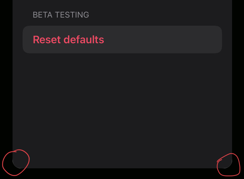
Screenshot showing light anti-aliasing on popup corners

Workaround: None that we have found yet. I tried the negative background padding trick from our Popover arrow colouring post to no avail.

The Author

Marc Palmer (Threads, Mastodon) is a consultant and software engineer specialising in Apple platforms. He currently works on the iOS team of Concepts sketching app, as well as his own apps like screenshot framing and backgrounds app Shareshot and video subtitling app Captionista. He created the Flint open source framework that people liked the idea of but nobody uses. You can find out more here.