So John Gruber and friends released a new iOS app for note-taking called Vesper. You can Google a bunch of reviews and other interesting details about it, and what it does and deliberately does not do.
Truly, I have no real need for a new note-taking app, as I have Day One which is for journalling but… journals are just notes tied to dates after all.
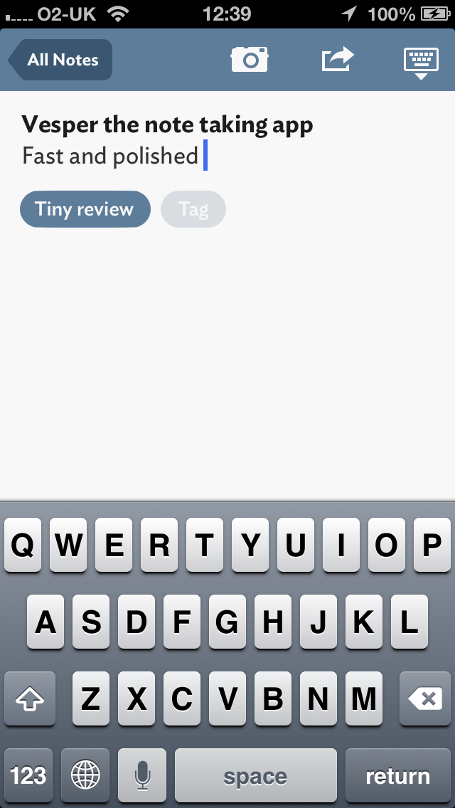
However I bought the app because I am an iOS developer and I like to keep abreast of the work that the respected people in the field are doing (the app was developed with Dave Wiskus and Brent Simmons). There are many things of interest about Vesper as Marco Arment has detailed. I won’t go into price, icons and so on here. I’m interested in the UI.

The first impressions are that the app is very clean and
interactions are all very smooth. A lot of time has been spent to make sure transition between views is not delayed – although it will be interesting to see how this bears up as the amount of data in the app increases.
The thing I like most about the app is the way the UI animations and transitions all “make sense”. Objects move out of the way of and past each other, as if they have the much-vaunted physicality that the iPhone UI and multitouch requires. The elements fade in and out rather than things spinning around or sliding in and out. The “burger and basement” used to access tags/archive is the exception.
Two specific interactions to try out in the app yourself – watch closely, they are really nice:
- Tap on a note in the list and watch how the rest of the notes disappear and the selected note moves into place where it will sit in the full view
- Tap on a note with a photo on it and watch how the photo zooms from the thumbnail to fill the space and the note text moves into place
Of particular geeky interest is the animation when you tap on a note in the list to view it on its own. Watch really, really closely and you will see that the font kerning on the note you select changes as it moves to the “full view” position. This is most noticeable if you do it with the top note in the list, as you can see it crossfade from the nicely-kerned version to the not-so-nice kerned version.
I’m guessing this is because Core Text is being used, perhaps indirectly, in the main list view and has better kerning but then this has to transition to an editable text field which is rendered differently to provide caret visual semantics that don’t look broken to people. If your typing is not inserted where the caret is or the caret jumps backwards and forwards depending on what letters you type, and in what typeface, things would get pretty tricky.
This is a slightly painful but acceptable compromise for the transition which is otherwise excellent. I think if I hit that problem in my own app I would chose not to use a crossfade here, and fade out and then fade in the new, so it would be unnoticeable.
I also like how the pull-to-search bar does not continue to scroll down if you keep pulling the list. I must work out how to achieve that. It doesn’t seem right that input UI elements should move around like they do in most of the “UITableView with pull-to-view UISearchBar” implementations that I have seen.

On the down side, I just don’t like the “burger and basement” UI paradigm to access the “other stuff”. I understand completely why people do it, but I am still not convinced this is a great UI paradigm and something better will come along.
Finally, I notice that they are using Hoefler & Frere-Jones’ “Ideal Sans” font. This is a beautiful font, and I have paid money to buy it in the past. This is why I find it surprising that it really irks me in the app. I prefer it at much larger sizes and heavier weights.
The font feels like it has too much personality at the weights used, and in particular the italic and bold variations used (see Archive in the basement) just make it look a bit too informal. It reminds me of that moment when I saw David Smith’s use of H&F-J’s Idlewild font in his Check the Weather, which unsurprisingly turned out to be controversial among users.
I’m looking forward to seeing where Vesper goes in future and what their company Q-Branch get up to. I’ll be tweaking and refining my future app’s animations some more too…
You can buy Vesper in the iOS App Store.